Most business owners find out their website is a problem the hard way – a customer mentions it in passing, or worse, they just quietly go to a competitor instead. There’s no alert that pops up saying “you lost a sale because your site took 6 seconds to load.” It just happens, over and over, until someone finally digs into the numbers.
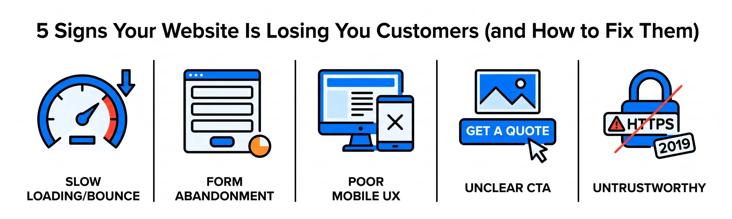
Here’s the uncomfortable truth: a website doesn’t have to be broken to be losing you money. It just has to be slow, confusing, or untrustworthy enough that visitors leave before they buy, call, or fill out a form. This post walks through five specific signs your website is actively pushing customers away – and what to do about each one.
If even one of these sounds familiar, it’s worth a closer look. We’ll show you what to check and how to fix it.
1. Your Bounce Rate Is High and Your Session Time Is Low
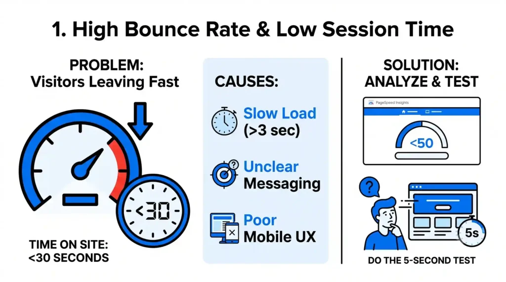
If visitors are leaving within seconds of landing on your site, that’s not a traffic problem – it’s a trust problem. Google Analytics (or GA4, if you’ve made the switch) will show you this in the Engagement report. A bounce rate above 55-60% for a homepage or service page is usually a red flag, especially if average engagement time is under 30 seconds.
What’s usually causing it:
- Page load time over 3 seconds (every additional second past that can cost you 20%+ of visitors)
- A homepage that doesn’t say clearly, within 5 seconds, what you do and who it’s for
- Mobile layout issues – over 60% of web traffic is mobile, and a site that looks fine on desktop can be unreadable on a phone
The fix: Run your site through Google PageSpeed Insights. If your mobile score is under 50, that’s likely your biggest lever. Also do a “5-second test” – show your homepage to someone unfamiliar with your business and ask what you do. If they hesitate, your messaging needs work before anything else.
2. Your Contact Forms Get Started but Not Finished
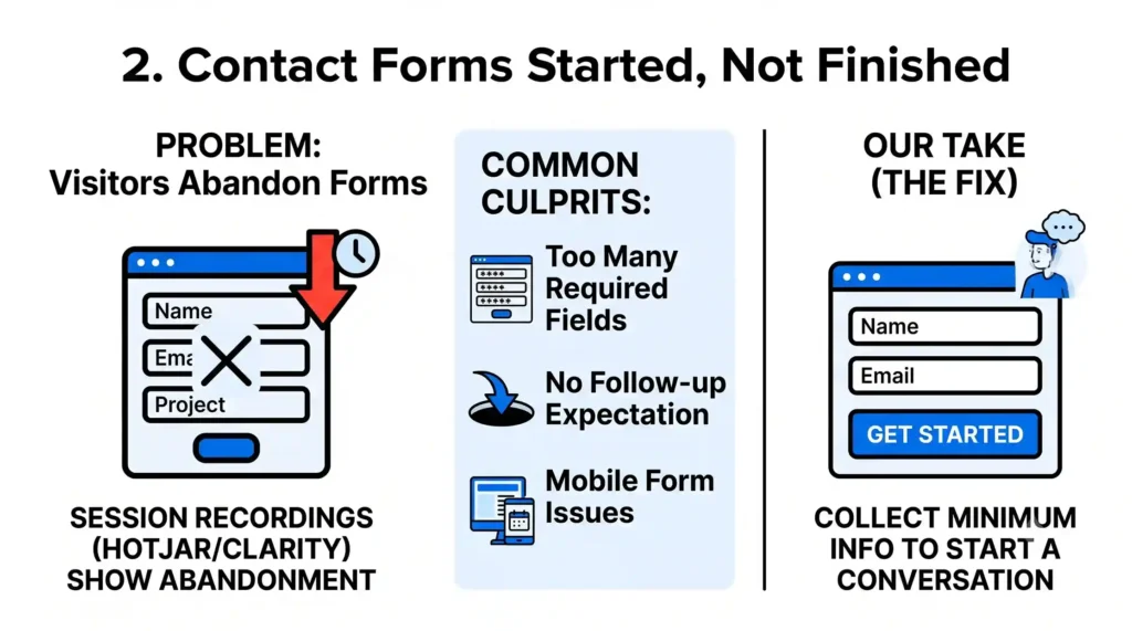
This one’s sneaky because it looks like interest, not loss. Someone lands on your contact page, starts typing – and disappears. Tools like Hotjar or Microsoft Clarity (both have free tiers) show form abandonment through session recordings, and it’s often more common than business owners expect.
Common culprits:
- Too many required fields (asking for a phone number, company size, and budget before someone’s even talked to you is a big ask)
- No indication of what happens after they submit – people hesitate to hand over information into a void
- Forms that don’t work properly on mobile keyboards (a date picker that’s impossible to tap, for example)
Our take: most businesses over-ask on forms. A contact or quote form should collect the minimum needed to start a conversation – name, email, and one qualifying question. You can always get the rest on a call.
3. Your Site Isn’t Built for the Device Most People Are Using
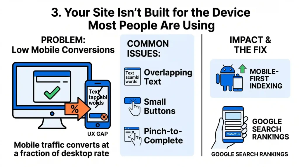
We mentioned mobile above, but it deserves its own point because it’s this common: [X%] of small business websites we’ve audited still have some version of a broken mobile experience – overlapping text, buttons too small to tap, or a checkout/contact flow that requires pinch-zooming to complete.
If your analytics show mobile traffic converting at a fraction of your desktop rate, that’s not a coincidence – it’s usually a UX gap. Google also uses mobile-first indexing, meaning it primarily crawls and ranks the mobile version of your site. A weak mobile experience doesn’t just lose customers directly; it can quietly hurt your search rankings too.
4. There’s Nothing on the Page Telling Visitors What to Do Next
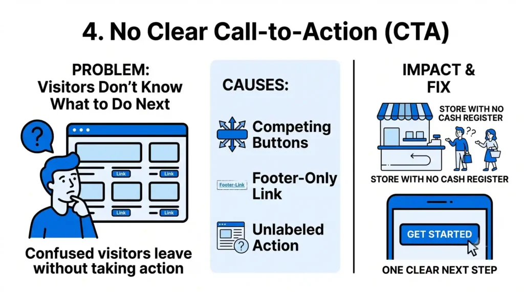
A website without a clear call-to-action is like a store with no cash register – people can browse, but nothing tells them how to actually buy. This is one of the most common issues we see, and one of the cheapest to fix.
Every key page – homepage, service pages, blog posts – should have one obvious next step. Not five competing buttons, not a link buried in the footer. One clear action: “Get a Free Quote,” “Book a Call,” “Start Your Order.”
Quick test: open your homepage and see if you can find the primary CTA in under 3 seconds without scrolling. If you can’t, neither can your visitors.
5. Your Site Doesn’t Look (or Feel) Trustworthy
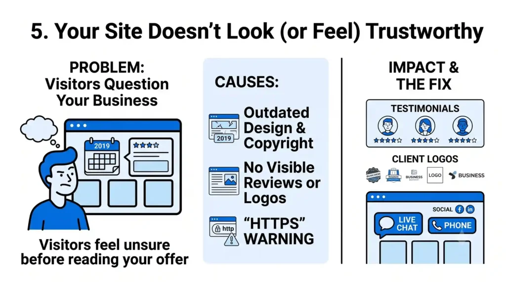
This is harder to quantify but just as real. Outdated design, broken images, a copyright date from 2019, no visible reviews or client logos, a “https” warning in the browser – any of these can make a visitor bail before they’ve even read your offer, especially for higher-ticket purchases where trust matters more.
Signals that build trust fast:
- Real client testimonials or logos (not stock quotes)
- A visible phone number or live chat, not just a contact form
- Recent activity – an updated blog, current copyright year, working social links
If your site hasn’t been touched in a couple of years, it’s worth asking: would you buy from this business, looking at it with fresh eyes?
The Bottom Line
None of these five issues require a total overhaul to fix – most come down to speed, clarity, and trust. But they’re also easy to miss when you’re looking at your own site every day. The fastest way to find out where you stand is to have someone else look at it with fresh eyes.
Want to know exactly where your website is losing customers? Get a free website audit from Nuclay – we’ll show you specific, actionable issues, not a generic checklist.
Want to Know Where Your Website Is Losing Customers?
Get a free website audit from Nuclay for specific, actionable fixes.
Get Your Free Audit Now